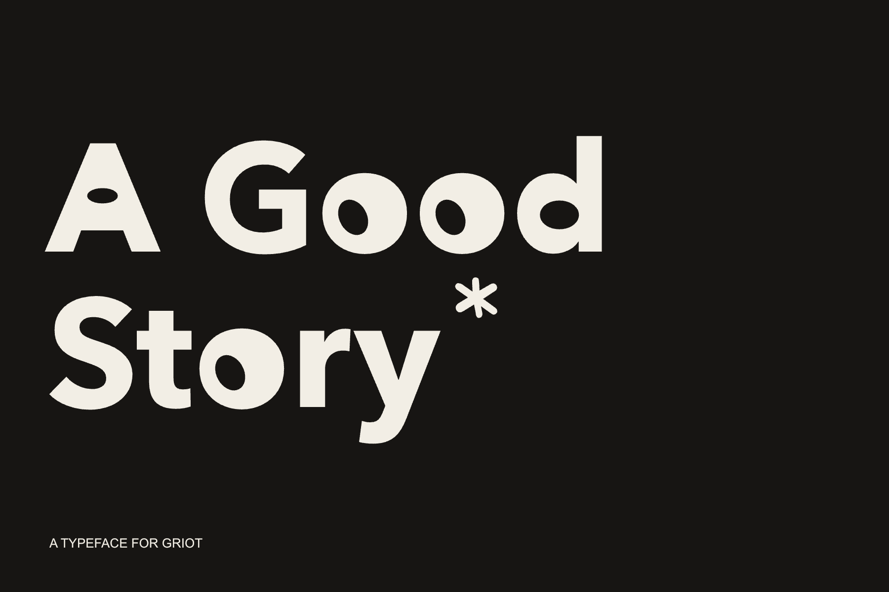
A Good Story*
A typeface that grew out of Griot.
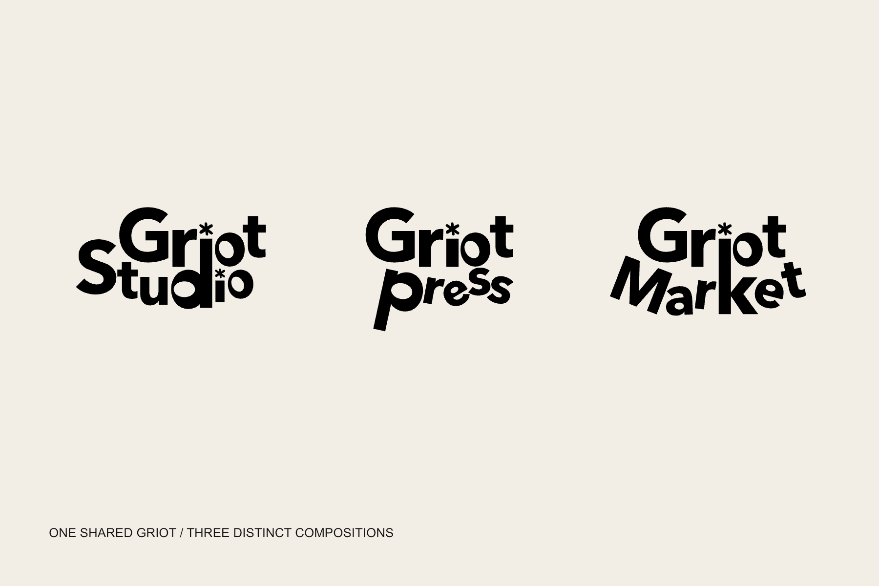
It began with the logos
Griot Studio, Griot Press, and Griot Market needed to feel like one family. They already shared the same Griot lettering. As I worked on Market, I became interested in the spaces inside the letters: an oval could shift a letter’s weight without changing what it said.
I started with Avenir Next Bold, the typeface used in the logos, and worked with the letters as individual outlines. The goal was to carry the character of the wordmarks into a typeface that could speak beyond those three names.
Movement inside the letter
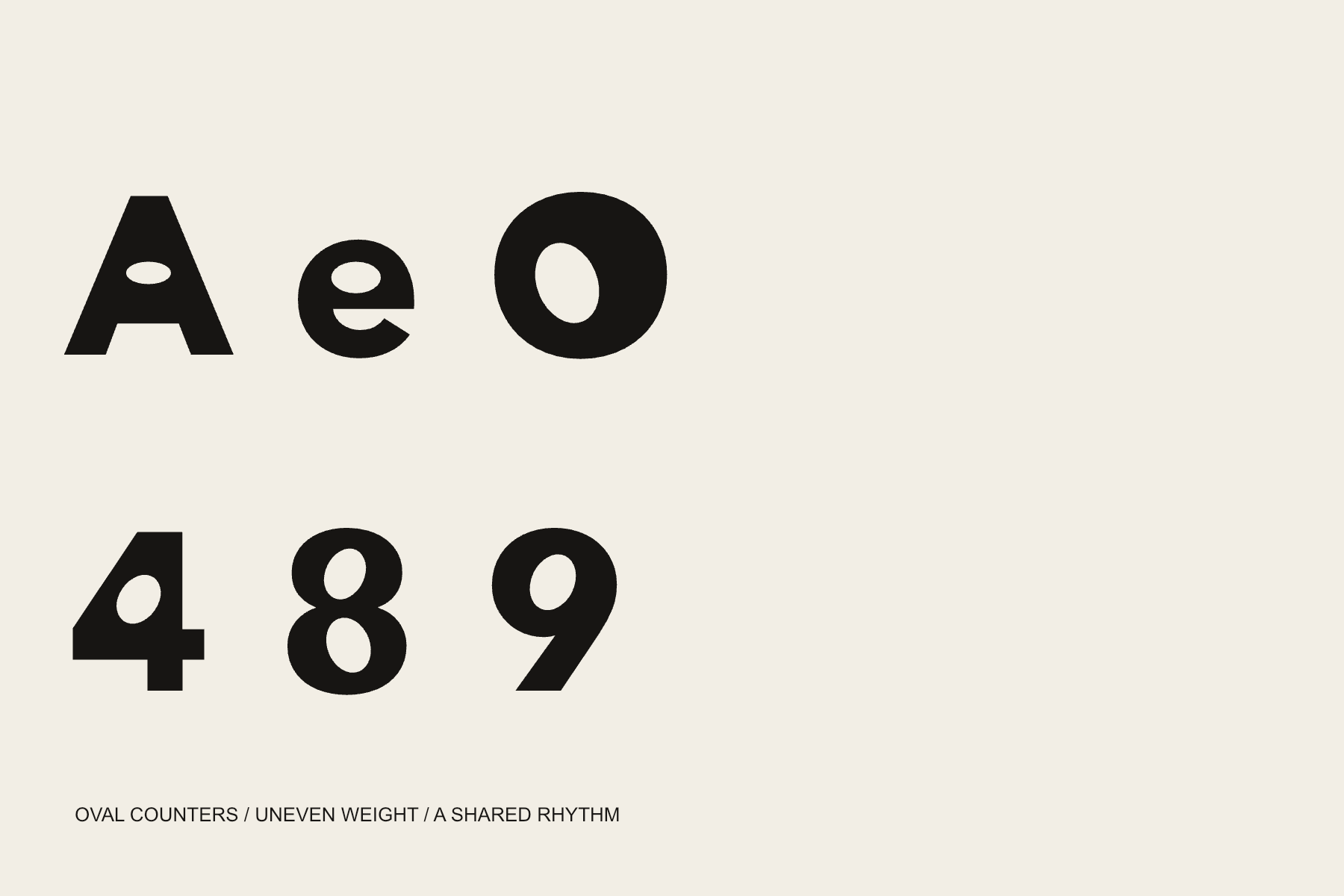
The counters are smooth, off-center ovals. In the A, lowercase e, and O, their position changes how much weight sits on either side. Some lean. Some sit low or pull upward. I wanted that small imbalance to give the letters movement while keeping the words easy to read.
The numerals follow the same idea. The 4 holds an oval inside its angular body. The two counters of the 8 work against one another, with a heavier lower half. Each shape has its own tension, but it still has to belong beside the others.
I tried more dramatic versions along the way. The quieter changes held up better. The distinctive part was already there in the relationship between the solid letter and the opening inside it.
The star above the story
The asterisk is the North Star. A Good Story* keeps it high above the words as a subtle reference to navigation by starlight, one of the many paths enslaved people took toward freedom.
Follow the drinking gourd. The Big Dipper points toward the North Star. That relationship gives a small typographic mark a direction and a story to carry.
Star-like forms in Haitian Vodou vèvè are another visual reference for me. That inspiration sits alongside the North Star meaning. The mark is not a reproduction of a particular vèvè.
The same heavy asterisk also replaces the dot on the i in the Griot logos. It can sit above a word or lead a line of text, carrying the connection back into everyday use.
Room for Yorùbá
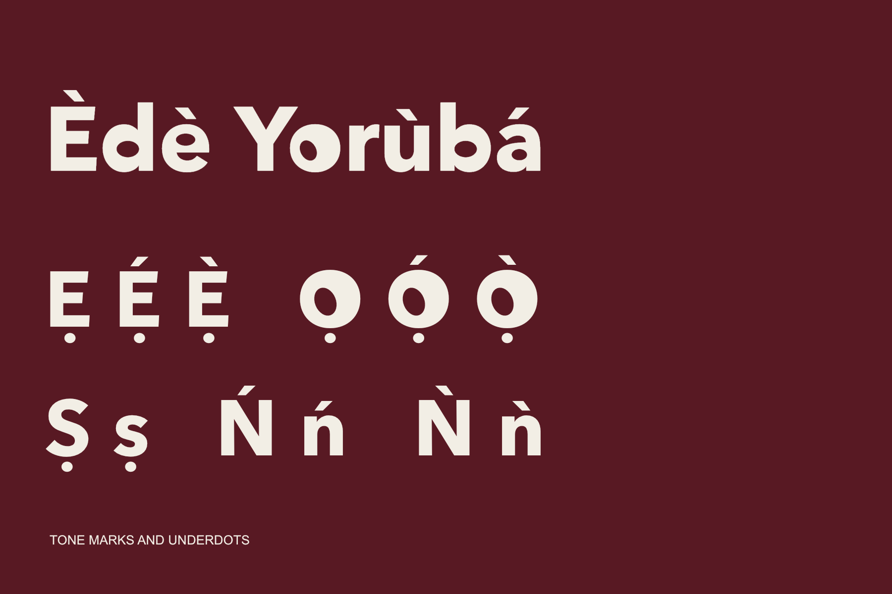
I extended the character set to include Yorùbá tone marks and underdotted letters. The marks need space above and below the letter, and they need to retain their clarity beside the heavier forms.
That meant working through combinations, not just adding a few accented characters to a specimen. The language support became part of the typeface’s development, alongside spacing, punctuation, and numerals.
Back into Griot
A Good Story* is an in-house display typeface for Griot. It brings the same character to a headline, a numeral, and a family of logos, while the Studio, Press, and Market wordmarks keep their individual compositions.
This page documents the design and its story. The typeface is an adaptation of Avenir Next Bold for internal use and is not offered here as a font download.